Thursday, July 31, 2008

I finally finished the Dirty Dare '08 challenges over at Splitcoasters.com. Alot of fun. I like that they make you think outside your comfort zone. New colors ... new sketches ... new materials ... new techniques. Although I missed out on some of the regular challenges this past week, I think I came up with some pretty nice cards. Here's a couple more.


While I did have a great time coming up with all of these challenge cards, I need to take the day off tomorrow and enjoy a little bit of the pool with my darling daughter, until the time comes when she doesn't want to spend time with me.
Thanks for visiting.

Wednesday, July 30, 2008

Omygosh, I can't believe how far behind you can get when you skip a day or two. This keeping up with your Blog business might take a little more work.

Anyway - I continued to do the Dirty Dare challenges from last week. We have to have them uploaded by August 1st, and I have 4 more to go. I was up til 3:00 am last night (this morning?) getting through Saturday's challenges. Here are my takes on what they asked of us.

Holly ('toy', one of our Dirty Dozen at SCS) wanted us to go for layers and use this sketch. It wsn't too difficult for me. I thought of a sympathy card I needed & everything else fell into place. For sympathy cards, I don't like a whole lot of bling or embellishments on them. I look at it that you want to convey your sympathies to the individuals, give them a nice card, but not one that will distract them. That's MY view, anyway.

Sharon (notimetostamp) was looking for a Simple card so this is what I came up with:

Friday, Joan (Joan Ervin) presented us with a challenge for silhouettes. I IMMEDIATELY thought of the new stamp I got initially for the July 4th challenges, but this was the first time I really spent some time with it. I wanted the patriotic feel, so I used my brayer & loaded red on one end and blue on the opposite end, leaving a negative space in the center. This worked perfect for the red-white-blue background (I think.)

Another Friday challenge, we were to dig out "all" of our cupcake designs - for me that meant this Inkadinkadoo set - it's the only one I have. But, how perfect could this be? I didn't even realize what I was doing, or whose challenge I was following until I got the card ready for uploading. Taylor (tayloredexpressions) chose the cupcakes. Well, my daughter (yes, Taylor also) is going to turn 13 (yikes!) next week, SO, guess who's birthday card this is ... Okay, so it's not that far of a stretch - yes, my Taylor's birthday card. (Long enuf to hold that wad of money she THINKS she's getting, lol.

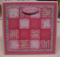
I absolutely fell in love with this card. Thank you so much, Julia (Julia S), for presenting us with a challenge to sew the card. I've been sewing since I was a freshman in high school (translation: MANY years), and papercrafting for at least 10. Do you think I'd ever try this, even after seeing many examples here on SCS? No, I have to be told (via challenges) what to do. I just was so happy with the results of this. Now I'm going to see if I can't find similar materials so I can make myself a quilt with these colors.

Rose Ann (cutterscallous) had us work on a Flap fold card. She wrote the tutorial that can be found [url=http://www.splitcoaststampers.com/resources/tutorials/flap_card/]. I kind of wanted the card to have a flap, but not necessarily LOOK like it had a flap. The panel with the bird actually is attached to the flap so the whole thing lifts up.

While I participated in the Make a Scene challenge - it's painfully obvious I need to work more - wait, buy more stamps so I can practice more, right? Yeah, that's the ticket! Thanks, Kittie (kittie747) for this one.

Jen (genie1314) gave us a very cool sketch to work on, and this is my offering ... Notice the main image popped onto 4 smaller squares, popped onto a rectangle shape, finally onto a square.

This challenge was from Laura (scrapnextras) and we were to distress, rip, tear, gouge (okay, gouge was MY contribution, lol)
I love this Northwoods image. After meticulously coloring it and cutting the oval out by hand, I went for it. I scrunched the vanilla cardstock a bit & then sponged chocolate over, highlighting the creases. As you can see, each subsequent layer - chocolate, garden green - each got their own "rip, tear, gouging" done to them. I sponged some more chocolate around the edges, which nearly obliterated my image, so I went back & erased a bit around the white daisies and the watering can, but left the rest to look aged. Initially I cut my ribbon nice & pretty at an angle (after distressing it by sponging more chocolate) ... but it looked to pristine even after coloring it, so I grabbed my scissors & king of 'snaggle cut' it (okay, not an official crafting term) & pulled at the edges so it would fray a bit. I'm thinking this just may look distressed, what do you think?

Well ... I started these stamps at 10:30 last night ("just one" - ahem, yeah rite!) and finished up at 3:00 ... I'll have to find some time today to finish off the Sunday challenges - I'm determined to finish them. Only one I may have a struggle with is the Primary colors one by TruCarMa. Don't get me wrong, it's a great challenge - but not colors I'm typically drawn to ... I suppose that's what a challenge is, tho, right? Going outside of your comfort zone. I'll do it, tho.

Thanks for taking another peek.
Ta-ta for now.

Sunday, July 27, 2008


Wednesday brought Lauren and Jenn's challenges. Lauren's was to make a monochromatic card. Jenn's was to take inspiration from the coolest set of cakes I've ever seen.
This is where she found them:


Tuesday's challenges - For the first, Julie wanted us to make a clean, simple white card with minimal acoutrements. Check.

Then Christine wanted us to use a watercolor technique. Here are my contributions for those challenges.
I feel like I've been kept in the dark for awhile - I didn't even know these cute Penny Black Hedgehogs existed until last couple of months. (And "No", I don't live under a rock.) I don't typically go for super bright cards, but I thought I stretched even so with the one on the right. My initial choice of the base card stock was coral to match the tips of the flowers, but when I laid it against the image layer, it screamed "SUNGLASSES", so I toned it down a smidge. I still like the way it looks.

Our last challenge was to make a masculine card. I have to be honest - most of the stamps I have are flowery, vintage or cutesy. I always cringe when someone says "masculine". BUT, I still did the task and came up with this:
I'm not that thrilled with the way it looks in the photo. In real life, the image is a bit darker and seems to meld with the rest of the card. Once agian, however, I wish Icould have done it a little differently. Thank goodness we're not getting graded on these cards, and it's just based on our best effort.

Dare to Get Dirty has kept me busy!

Between these Dirty Dozen challenges and life, I've been kind of busy. I started off the challenges doing a bunch of vellum cards. I knew I should have held back. I ended updoing about 6-7 of them (probably because I was all fired up.) The first day, Jody (texasjodylynn) had us work on a card from the ribbon out. I don't recall ever seeing it, so I immediately thought of putting ribbons at each of the 4 corners. From there, I figured I'd try to use the Fiskars scallop around the entire border. (My wrist still hurts 5 days later.) Even with the tin foil and the was paper punches, I still can't get these Fiskars to punch smooth.
Anyway, here's a picture of my ribbon card.

As I said, the next was for the vellum challenge. I'm only going to include my favorites here:


As soon as I put the vellum through the Cuttlebug, I knew I wanted to use it as a shower curtain. Yes, okay, I went out to the stamp store and bought the Whipper Snapper's Hog Wash that day. I also like the card with the green ribbon. I embossed the image in white on the vellum and flipped it over to color it. I flipped it back over & used a Dreamweaver stencil in diamond grids along with SU's Going Grey to 'shade' at the intersections of the diamonds. You can just make it out from the photos. I really like the way the diamond patterns look with the vertical stripes in the background paper.
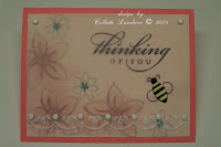
As for the third card, I just like the softness of the look. I stamped underneath and stamped the sentiment image on the vellum layer. I also attached a cute bee brad I found at the store to help keep the vellum attached.

Thursday, July 24, 2008

Dare to Get Dirty Challenges ...

If you're a Fan Club member on SplitCoastStampers, they're having their Dare to Get Dirty Challenges all week. You can see the forum from here (if you're a Fan Club member).
http://www.splitcoaststampers.com/forums/forumdisplay.php?f=150

Sunday, July 20, 2008

Thanks for dropping by. My latest attempt at working with this stamp from Cornish Heritage Farms - Sisters. I've not been that pleased with previous attempts and I may have figured out why. I've been using the black stazon inks, but for this card, I tried the sepia Versafine and viola! What a difference. I'm liking it. Since I was focusing more on the cracked glass technique here, I didn't want to make the image too busy, so I faintly watercolored in very pale colors. This was for a challenge over at SCS - to be inspired by their featured stamper for the week, Susiestampalot. Her gallery is chock full of great stuff, so it was hard to pick just one, but I'm pretty satisfied with the results.


Here is my latest contribution to the Inspiration challenge over at SCS.com. The inspiration was to be found on Kay Lamb Shannon's website. Anne (Itsapassion) was subbing this week and had picked the rooster on the outhouse poster.
I thought I had a rooster (had the card all set out in my mind), but nothing ... who doesn't have a rooster, for Pete's sake? Anyway, headed out to my local stamp/scrap store, nothing ... so trekked on over to Michael's (mind, gas is now $4.24 per gallon), nothing. I didn't want to hit the Hobby Lobby 'cuz that was going in a whole 'nuther direction, so I came home defeated.
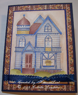
So (you say) .... why didn't you look at the rest of Kay Lamb Shannon's gallery - there's more than just roosters! I'm a dork ... that's why. Found some victorians, so pulled out my old Victorian standby & watercolored it. AND, since I was using a Victorian house, I intentionally searched out this old miniature dollhouse wallpaper my mother in law gave me some time ago. Thought the old pattern was perfect to use as a background for my victorian house. Because I mounted this on navy, I put 2 panels of copy paper inside for a note.

Thanks for looking.