Wednesday, August 27, 2008

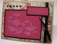
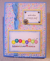
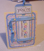
Got up early yesterday and stamped, stamped, stamped. I caught myself up on the SCS challenges from Kokirose's Featured Stamper to faux dry embossing to the color challenge. And, I made some extra birthday cards to catch up. I also made a Welcome card for our cousin's newest edition, Colton. I'm only going to describe the one, Faux Dry Embossing technique since the rest are fairly self-explanatory.
The Faux dry embossing was done using tone on tone stamping - this works best with either a silhouette or outline or flourish stamp. I took Rose Red cardstock & stamped in Red Red ink, then (works best if you have a Stamp A Ma Jig) after cleaning the stamp, ink it in white pigment (craft) ink & slightly skew the image - just a fragment, maybe 1/16th of an inch, almost so you don't even notice the difference. It actually looks like I used a stencil & the paste to raise the image. I love this. I've used this technique before, but you always forget about them somehow.

I can't be too chatty today because I have to read 2 chapters for Microbiology before tomorrow's class.
Kokirose (Patricia's) Featured Stamper challenge:


These were for the Faux Dry Embossing Challenge as well as the color combination: SU's Kraft, Rose Red, and Black. I like the way they go together!


And these were my miscellaneous cards ...


Thanks for stopping by !

Sunday, August 24, 2008

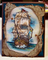
Had time to do the Ways to Use it challenge which involved Tearing. I'm not a huge fan of this ... but when I do it, I really enjoy the results. I got this image in the Pay It Forward thread in Wednesday's mail, so it was the first thought that came to me -- pair it with my Old World map. I was just going to distress the image, but I really like the way the prismas & gamsol made it look. I tore the image & put the map on kraft & tore it as well, sponging & dragging through the distresser & ink pad. I thought it'd look cool to put 'nails' on the image & make it look like it was torn away from the nail - okay, I think it looks cool. I was going to keep it all brown, but like the way the teal layer ties into the water. I'm pleased with it, and that's what counts, right?
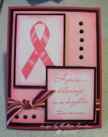
The next card was for the Limited Supplies - although they seem to be taking a break from the 'limited' part, which is okay by me. We were supposed to pick a stamp or set that hadn't seen ink for awhile. This wasn't a hard one for me ... I actually don't think I've EVER used the ribbon set. (One is Hope and one is Hope Is...) I used the ribbon from one and the sentiment from the other. I always felt awkward using the stamp, especially since I don't know anyone personally who's been involved in the Awareness movement (regardless of the illness) - knock wood. Didn't want to bring on bad luck-type of thing. Anyway - I used them (will give this card to a friend of mine who's active in the Relay for Life in our area.
I like the way the card turned out, so I decided I'm going to make a bunch of them with the yellow ribbon to send to Mindy Young over at SCS to forward on to http://www.operationquietcomfort.com/.
Friday night brought on a whole new challenge thread that I'd never done before: VSN - Virtual Scrapbook Night - They have the occasional challenge where they change the theme. This weekend's them was Books ... old, new, young, old ... they had it all. Challenges were limited to 45 minutes (on the honor system) to make each card. With the ones I finished, I managed to make it under the 45, but I just ran out of time. This was a crazy BIZZY weekend. I'm putting life on hold next weekend, though, because SCS is having another challenge for Labor Day. I had SUCH a good time doing the 4th of July challenge, that I'm really looking forward to this one, too.
Anyway, here's a few of the cards I came up with for the Book Club challenges:

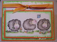
A-Based on Brown Bear, Brown Bear - I used the Black Sheep character.
B-Based on favorite childhood nursery rhyme or story. Well, I HAD to pick Bunny Foo Foo ... long story. I got this image from the PIF thread as well. I HAVE to find the stamp - he's absolutely Fabulous! Love the square cards, just wish they weren't extra postage!

C- This was to include a bookmark. On Friday night, I went to my demo's house for a Mother/Daughter Stamp Camp (Thanks a bunch, Eileen), and we used this Pocket Fun set for a post it holder (see Eileen's site: http://elefevre.blogspot.com/ for more info on the projects); so the set was fresh in my mind. We also worked on some pixie sticks holders - and the technique she taught us there was fresh, SO - guess what - RIGHT! I used both. This is a JUMBO paper clip & on the back of the girls, it's mirrored w/the layers, but I put the larger sentiment from this set on the back. The paper clip can come out and be used as a book mark.
D- Not happy with the results, so I'm not going to post it ... I wouldn't waste your time going to SCS to see it, either ... lol.

E- We had to incorporate twine into the card. I used the misting technique to stamp my new image from Penny Black stamps, Sweet Pleasures. As you can see, I used it to 'bind' the left edge as if it were a book. I went a step further & lashed the twine around the flower stems. Thought it looked cool.
F- We had to use sugar free Kool Aid for this one ... Does anyone already know what I'm talking about? We mixed it with clear embossing powder and it smells a bit like orange (in my case) Kool-Aid. I call it my 'Scratch ~n~ Sniff card', although I'm not sure you're supposed to scratch it. I'm not sure how long the scent will last.

G- This was one of my favorite ones. We were supposed to use newsprint, newsprint DP or a stamp with newsprint inspiration. I found this cool stamp at my local stamp store and decided to make a collage background for my card on vanilla c/s. I added some Penny Black silhouette flowers, some flourishes and a couple of swirl shapes - all in chocolate brown, and think it turned out well. I stamped the image (Penny Black Fresh Fields) onto Sage cardstock in chocolate ink as well. I did the same with the separate sentiment distressing both panels & then dragging through the chocolate ink pad & sponged them. (For someone who doesn't care for the tearing methods, I seem to be quite pleased with the results.)

H - This was another bookmark. I didn't pay attention apparently, because I just made a card at first with a bug theme ... went back after I'd finished to find out -- Oops. Today was a crazy hectic day with cheerleading, so I didn't get a chance to play around with the challenges again til later this afternoon. I redid the bookmark card, but kept the similar colors cuz I thought they looked so good.
I - Pearl Ex - I used Versamark to get the 'glue' for the pearl ex powder to stick to - used the gold on both the heart image as well as the sentiment. I was going to put some ribbon in the upper right corner, but we (me, myself and I) couldn't seem to agree on what to put there, so "I" won out - and left it. Sometimes with gold you have to be frugal with the rest of the stuff.
K - This was my last card. We had to watercolor. Okay, not so much a challenge since this is my favorite method. I had an image in mind, this PIF'd one, problem was, it's on regular cardstock, so I ended up using a blender pen and water color pencils instead of traditional watercoloring. I so love the water color paper with these images. Not 100% pleased with the flower colors, but I LOVED the way the clay pot turned out - What clay pot is that you ask? Well, I need to put a birthday sentiment on it, so, you CAN'T see it ... lol. Kitty is our Snickers - can't you tell - grey Tabby? I'm so stymied by my pink cards - Not a 'princess' kind of gal, I like my frilly stuff, but this is like the 10th pinky-pink card I've come up with - I don't know where they come from? Pink isn't even my favorite color. (Although this ribbon IS pretty close to my favorite - the wide satin with polka dots).
I ran out of gas AND time at 9:00 tonight since we were supposed to have them uploaded by 10 pm, so this is it for me. My DH has been working on removing a futon from one of our spare rooms, so I'm thinking I may FINALLY be able to move the goods upstairs so I don't feel quite so abandoned when I'm stamping.
Thanks for listening to my rambling.
Wish me luck this Tuesday when I start Microbiology .

Thursday, August 21, 2008

Well, I seem to be surviving without the munchkin during the day. Trying to get cheerleading stuff out of the way - they just started practicing and games are coming up the end of the month. Can't wait to just be a spectator! Even with busy work, I still am finding time to make some cards. I'm hoping when I start school next week, I'm able to continue to find time for card making.
I'm in love with this box - never tried it before. Check Tutorials "Acetate Treat Box" by Suzy McCormick for the directions. I had a heck of a time with my first attempt, so I tweaked the cardstock scores and it worked out perfect the 2nd time around - you may have better luck.

This was my Color Combo challenge card as well as Featured Stamper (Knightrone - Jessica's got some great cards; to take a peek, here's her site: http://www.splitcoaststampers.com/gallery/showgallery.php?ppuser=61504&cat=500 )The colors were Ruby red, Close to cocoa and Blush blossom. I've made these birds in blue, but I do like the red/cardinal look. I flipped Jessica's layout on it's side for my version. I think I could get used to this combo. Image was colored with the gamsol magic technique and sponged with the ruby. The blush oval was cut in 1/2 and I stamped a flourish stamp from inkadinkadoo all over & sponged the edges of it as well. I used my cuttlebug to swiss dot emboss 1/2 of the cocoa and then one of my SU wheels w/stripe on it in cocoa on the other 1/2 of the cocoa.
Yesterday, we were given this sketch. I think it could be my new favorite, at least until the next one comes out. I started with the lavender one. The DP is from the dollar store - whole pack of 25 sheets for $1. I got the image from PIF'ing - a bonus. I actually used the same flourish stamp for the circle panel in eggplant. Sponged the edges of the image and the circle panels with eggplant. I don't have any purple-y ribbons (gasp! - That's my favorite color - whats up with that?!) - so I used eggplant c/s set at a diagonal & dotted the edges. I love to doodle, but sometimes a few dots goes a LONG way, so I'm hoping it's not too much. Someone said it looks like piercing. When I finished, it just looked a smidge bare in the opposing corners, so I popped on some corner punches & brads.
I had SO much fun with this sketch that I had to run out and buy some more paper - You don't understand - 2 full file drawers just ISN'T enough (you KNOW what I'm talking about) ...
So found this 2 sided Heidi Grace card stock and IMMEDIATELY knew it was what I HAD to have. I got the image from Wish RAK over at SCS & colored him in with prismas and gamsol. I layered onto pretty in pink and banana, sponging each layer with cocoa. I dotted the scalloped circle (nestie) at the scallops. Used a chocolate colored ribbon at the diagonal with knots in each corner & popped up the image panel on dimensionals. I think the paper is busy enough that I didn't need anything else.

Well, I'm off to clean some carpets .... (over stamping, you say? I promised my MIL I'd do her living room - if it was MY carpet, it could wait til I was done stamping "Just One More".)

Thanks for peeking in .... and I leave you with Snickers ....

Monday, August 18, 2008

What am I going to do now?

Omygosh - what will I do now ... Today was my darling daughter's first day back at school and I feel like I'm at loose ends. Should I stamp - oh YEAH! Should I clean the house from the summer's neglect - um, that can wait, after all "Tomorrow is another day". I have one week left of freedom before I start back to school myself. Microbiology is calling my name (or rather bleeting harshly). I just took the NLN last week, so lets think positive thoughts, right?
I had a chance to make a couple of cards over the weekend, so let me know what you think ...
The first card was for an Inspiration challenge (IC141) over at SCS. Not what I had in mind when I started, but then, I actually like the end result, a little simpler than the original Athleta swimsuit I had settled on. The one on the right is actually a PIF I got from Stacy (SCS's JBgreendawn). She's got lots of fabulous cards, too, so click here http://www.splitcoaststampers.com/gallery/showgallery.php?cat=500&ppuser=83767 to see some more. It's almost a replica of her sample, but there's not alot I could change besides the flowers I colored with prismas. I smoothed the colors out a little with OMS. I never even thought to do something like this before, so I'm grateful for Stacy's inspiration as well. Thanks for stopping by.

Friday, August 15, 2008

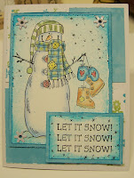
This was our latest challenge over at Splitcoasters. I searched & searched through my stash and the only snowman I could come up with was from "Let it Snow" ... An old tried, but true set, one that I can't bring myself to get rid of. I tweaked the colors I used, going with turquoise & olive accents. I really like the way the card looks - clean and fresh - not like the traditional green & blue images out there. Hope you all liked it. Thanks for stopping by!

Hello ... been stamping a little bit here and there - in between getting munchkin ready for school next Monday. These two challenges were to make a simulated stained glass window. For the flower one, I used stazon on the acetate sheet and punched out the oval in the card stock base, then, on a piece of lighter paper (blush blossom) I stamped the sentiment along with some of the itty bitty backgorunds speckle. I mixed some reinker colors (Primrose & cardinal, separately) with some Crystal Effects & it blended really great. Did the same thing for the leaves & stem. I passed the card base through the CB embossed with Swiss Dots & then sponged over entire card with Ruby Red to bring out the dots. inished off with wasabi ribbon. As for the second one - as you can tell, this was much more timeconsuming. I actually used this for the Stained Glass challenge as well as the color challenge: Teal, Old Olive and Elegant Envy. I love the way the clouds in this stained project turned out. The card with the cross was done in 5x7 size, while the other is standard size card.
For this challenge, the theme was Crazy for Copics. Well, I have 2 gold Copics - quite by accident. I bought them to make a sign for our Purple and Gold cheerleading squad. (GASP, you say?) Yeah, okay, it was the only marker that came in the color I wanted for the poster board. And might I add, the poster turned out great!. Anyway, I have so much invested in my ZIG brush/calligraphy markers, that I don't want to even invest in the Copics just yet. One of the SCS long-timers suggested a website that I can't believe I haven't seen yet, and more importantly, showed a tutorial for using Stampin' Up markers to make the image look like a good watercolor. Okay, I say - THIS ONE'S FOR ME!! Easy-peasy, I can't believe I've never tried this method. If you're interested, Julie Buhler gives a GREAT tutorial here:
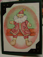
My first attempt was the Ol' Saint Nick by Impression Obsession. Love the way he turned out. On to my next ones, the fairy - loved her wings & skintone. Third, one of my favorite stamps: Girl Collecting Shells.
I love how they all turned out & this new marker with aqua pen gives more control in the tighter spaces - more versatility in my watercolored cards - I love it!

Wednesday, August 13, 2008

Been busy going over stuff for the NLN exam ... just finished it last night. 3 hours - holy cow. Feel pretty good, but some of that science wasn't in any classes I've had so far - maybe even Physics, not sure. I'm not clear on what alot of the stuff on the exam has to do with nursing - but we'll see.
Anyway ... here's some of the stuff I've been up to lately:
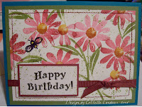
I always go back to some of my favorites & some of my newer sets hardly ever see ink. I colored directly onto the flower image with a Zig brush marker then rocked the flower in burgundy ink pad. Did the same with the flower centers. To pop them, I put Crystal Effects on the centers. Not sure if you can see it, but it looks good IRL.


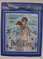
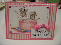
These are some fun birthday cards I made. Love to watercolor these images ... Need to stretch myself and go for the stamps that use colored ink.
Thanks for stopping by ...

Thursday, August 07, 2008

Happy Birthday SmileyHappy 13th, Taylor! Happy Dance

(Well, not quite, but we celebrated with 4 of her girlfriends at a waterpark/hotel). I was so miserable at the waterpark (feel like I've got a giant jawbreaker stuck in my cheek) in between tylenol's I had about an hour window. But at least the kids had a great time. I doubt they even knew I was hurting, which is a good thing. Today's her actual birthday & once she gets done with cheer camp & gymnastics, we'll go out and celebrate - just the family.

When we came home yesterday, I was feeling pretty good, so I decided to try to play catchup on the SCS challenges, and here's what I came up with:
For this one, our challenge was to use scraps. Although I hate the punch (or rather my wrists do), I found some blues and greens that were laying around, too small to do much with. I punched them & mounted on white cardstock then free-hand cut a border around them to mount on the other 2 layers of blue/green designer paper. I think with all the pattens clashing, they almost match, don't you? I've had these oversized brads for what seems like forever and finally felt the opportunity has arisen to use them here. I'm not typically drawn to the brighter colors, more muted is my taste, but I was so happy with the way these flowers looked on the background, that I couldn't help but remember the sentiments I got last week in a PIF exchange.


Another challenge was to make a Square Spring card. While I've tried the Explosion Card, I've never done this type. It's almost just an Explosion card, minus the one end. I used the misting technique where you color the stamp directly (I have boatloads of the ZIGS), then mist it lightly with water & stamp the image onto paper. I've been trying to utilize more vellum, so I laid a piece on top of the image & then applied a rub on "Happy Birthday" with the brads. I'm so lacking in the SU designer paper, so all I could do was take the SU guava and stamp (also in guava) with one of the little background stamps (butterflies in this case). I need to remind my demonstrator to push me when it comes to ordering the DP when I order the cardstock. (One bad thing about the orders taking awhile to get here - I sometimes need the immediate gratification of a purchase). Anyway, I was pretty happy with the way it turned out.

This challenge was to use the Stampin Up 2008 In colors - as many as we wanted. I really like the guava and wasabi combination, and I found this designer paper in my stash that has the flowers nearly the same colors as the guava. Just got this SU corner punch (I know, what the heck took me so long???) .. and love it!!

This was my last card for yesterday - it was a sketch challenge and we were supposed to keep the triangles as is. I got this image from the Wish RAK over at SCS. I just love the Whipper Snapper collections. My local stamp store rarely has them in stock. You have to wonder how they choose their inventory sometimes. I mean, arent' they supposed to cater to MY tastes? (Actually, my tastes are so eclectic that I dont' think ANY stamp store would be able to stock the things I want, when I want them.)
Speaking of sketch challenges ... I love them. I find myself sticking to some of the tried & true layouts so often, that I don't always branch out unless prompted to. I think I should probably go back & look at the different sketch challenges on the various sites I've been stalking and just commit to doing a new sketch every day. By the time I actually started doing things on SplitcoastStampers.com, the sketch challenges wer in the 160's, so I at least have that many days' worth of different layouts, right?
Anway ... that's my "Show and Tell" for the day. Thanks again for stopping by.