Saturday, February 28, 2009

My First submission for a Designer Call Challenge

Those of you that know me know my new 'hero' is Elisabeth Bell. She has the most fantastic artistic style. She has her own website here if you're looking for more of a 'fix' for her work:
http://www.zhibit.org/elisabethbell/blog
I first learned about Elisabeth from the Whiff of Joy website, which can be found here:
http://www.shop.whiffofjoy.com/, and I think I've pretty much bought every one of their Elisabeth Bell stamps. (If I'm missing one, let me know and I'll immediately rectify the situation! lol) ...

Anyway, this image is from the 2009 Spring Kit that was just released last month. This is Willow with Flower Basket. Another absolutely beautiful image, thank you, Elisabeth!

I colored her with prismacolored pencils and gamsol, then highlighted it a bit with my white signo gel pen. For the swirls at the base of her jeans, I added a clear star gel pen. I also added to the flower centers in the basket, her bracelet and her buttons. I sponged the perimeter with baja breeze, ticket punched the corners and added faux 1/2 pearls to the bottom corners.

For the DP, I chose papers from the Manchester DP pack from SU - wonderful combination. I matted the various layers with either baja breeze or chocolate. The scalloped edge was done with the SU scallop border punch, then I added faux 1/2 pearls to the scallops.

I get so mesmerized by the Elisabeth Bell images, that I'm always forgetting to get their sentiments, so I used one of my new Angel Company sentiments, circle punching it and matting on chocolate circle punch, up on dimensionals. I finished by adding 2 more 1/2 pearls. For the vertical piece, I had to tie a chocolate satin ribbon in a bow ... Willow certainly deserves the extra effort that goes into tying a bow, right?!

Anyway ... I hope you like her ... and I hope I did her justice. Let me know.
This darling card was made following the SCS Limited Supplies challenge for Friday. We were to create our own designer paper using one, and only one stamp set. I've been meaning to send out a new arrival card, and this was just the kick in the pants I needed.
I used the Stampin Up 'Soft 'n Sweet' set and stamped the rattle, bootie, teddy bear and sentiment in cameo coral and close to cocoa randomly over a piece of vanilla cardstock, and then sponged with cameo coral before I matted onto the card base, cameo coral.
The main image was stamped in close to cocoa on vanilla and sponged in cameo coral, then matted with cameo coral. I added 3 matte white brads and a grosgrain bow at the corner then popped up on dimensionals.
I was looking for simple, and think this fit the bill. Such a sweet card, what do you think?

Friday, February 27, 2009

Here are some of this week's challenges that I participated in ...
The first is the Color Combination:
Summer Sun, Pumpkin and Kiwi. I'm pretty tired of winter, so I was drawn to this beach scene. I colored the hammock in pumpkin and then tied in the colors with the mats. On the left side, I used an eyelet edge stamped in kiwi on the summer sun base. I added some yellow stickles between the lace. I also added some crystal effects to the glasses, glass, shells.

This was the SCS sketch challenge this week. Since I had the same colors from yesterday's color challenge, I went with those. I stamped with chocolate from the pocket silhouettes set and matted on pumpkin, popping them up. The base is kiwi and the "BG" is actually a sheet of pumpkin that was embossed with the argyle pattern from the Cuttlebug. The cross yellow piece is embossed with the swiss dots pattern and sponged with pumpkin. IRL the ribbon looks a closer match than it shows in the picture, but I'm happy overall with the results. What do you think?


This challenge was to be frugal or recycle. This scroll or flourish was stamped months ago and wasn't all that thrilled with it, so it's been sitting in my box of precut cardstock. I was going to stamp the back side with something else, but never got around to it. Here, I cut it out free form and circle punched the coordinating flowers, adding copper brads. The not quite navy layer was rolled with the jumbo wheel in the burlap pattern - I only have creamy caramel, so had to go back & forth, up & down and diagonally til I was happy with the 'texture'. The sentiment is from warm words, matted on NQN and then black. When all was said and done, looked a bit 'empty', so I added some dots with the signo gel pen around the sentiment and in the corner to simulate paper piercing. Not a fan of the dots, so those of you that know me know this was outside my comfort zone ... but I did survive, lol ... and will probably break down and use them again.
Anyway ... thanks for taking another look inside my blog ... Have a GREAT DAY !

Last weekend was the VSN "What's Love Got to Do With It" challenge of 20 (if you count "H"s double whammy). I was lucky enough to get to be the hostess of one of them. Each challenge was released at the top of the hour and we were given 45 minutes to complete each challenge. What fun ... I love the challenges, and often look for the SCS ones the night before, if I'm lucky, so putting them back to back to back was wonderful.
I had to leave for a couple of hours on Friday, and then Saturday didnt get home when I wanted to, so ended getting backed up, but I was able to complete all but 2 of them. (And I'm sure I'll go back and finish those soon.)
This was my first hostess 'gig' and it was a lot of fun ... little nerve-wracking, but fun, nonetheless. This time some of the member companies at SCS donated prizes that we could award for each of the challenges. Now THAT part was incredibly hard - picking out from all the wonderful submissions. The winners will be announced by this weekend, I think.
If you're interested in trying these challenges, just for fun, feel free to check this out:
While the contest is over and submissions had to be in by last Sunday midnight, there are some fun twists to try out.
So, here are the cards I made ...
For the first challenge - we were to use oversized heart and circle on the card. I only had the Creative Memories heart template, so I cut from some rose DP. I distressed both circle and heart and sponged with rose. Because I wanted to emphasize the circle/heart, I kept the image small, coloring with prismas/gamsol and finishing with some rose ribbon.
For this challenge, we were given 3 choices of chocolate with a color theme ...
White Chocolate (too sweet for me)
Dark Chocolate (too bitter for me)
Milk Chocolate - just right
For the milk chocolate theme, we were to use cocoa, amethyst and real red. The image is a Changito (Archiver's exclusive) monkey that I sponged the edge with real red and added the itty bitty speckled stamp to. I matted with cocoa and amethyst. The BG is actually cocoa that I stamped in real red and cocoa from the Changito Valentine or Cupid set (maybe a little from both?).

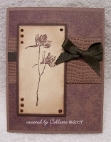
The title for this challenge was "Bittersweet Love" - to take an unappreciated stamp and make a lovely card. I think I may have tried to use these stamps a handful of times over the last 8-10 years with little satisfaction. I was determined to make it work this time. Maybe new techniques helped? The tree trunk was stamped with cocoa and then I tweaked it with some prismas & gamsol. The branchy part is actually about 1/2 x 1 inch and I colored direct to stamp in 2 different colors so it gave the mottled leaf appearance. While I probably should have drawn in a more curvy or hilly horizon, I'm actually very pleased with how this turned out. I matted on hunter and added some copper brads then punched the corners with the ticket corner punch and popped up on dimensionals. Finished by tying a hunter colored ribbon over the DP. This unappreciated stamp has moved closer to the front of the line now.

This challenge was to use something new. I had just received this stamp, the DP as well as the 'ribbon'. Image was stamped with versamark and embossed with white then sponged with rose. Blush blossom was the base for all the panels as well as the card base. I cut apart the embroidered daisy ribbon to simulate brads in the corners of the image panel and left a strip on the lower panel. Don't know if it shows, but the DP has a bit of a shimmer to it.


Monochromatic was the theme of the day here ... I loved this DP and wanted to make my card based on that. I stamped in chocolate the flower image on vanilla, matting on chocolate and popped it up on dimensionals. The cross panel is cocoa that I embossed with a CB folder then sponged chocolate over - looks just like leather if you ask me - then finished off with a strip of ribbon and some distressed chocolate stickles.


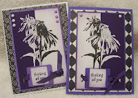
I am definitely going to have to check out more embossing powders to expand my stash. This technique was the split negative technique, which I've never done before. The object is to stamp 2 of the same images - one in dark on light cardstock & one in light on dark cardstock, split them and put the opposites together. Best if you use a silhouette style of stamp image. This was fabulous ... I loved the way they both turned out. If you'd like more information on this technique, Lori Craig has put together a wonderful tutorial here: http://www.splitcoaststampers.com/resources/tutorials/split_negative/

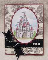
I actually had to rent the movie "Princess Bride" to finish this challenge because I hadn't seen it in some time. We were to use our favorite quote and be inspired to make a card. I couldn't come up with anything pithy or original, so I stuck with a castle ... I received this image from **Carol** over on SCS and colored it with prismas/gamsol. I love the BG DP paper - black 'n white toile that just went perfect with the rennaissance (sp?) effect I was going for. I didn't want to pierce the ribbon for brads, so I added some liquid pearls to finish it off.

This card was actually a "two-for" ... What was my Obsession (why, Elisabeth Bell images, of course, haven't you guys figured that out?! lol) ... and to incorporate things from the Sound of Music's "My Favorite Things" song. "Raindrops on roses ... tied up in 'ribbon' ... " The dp is from the Bittersweet pad from Basic Grey - a perfect compliment!


The challenge here was to use the melted crayon technique. I stamped the image and popped it up after matting on dimensionals along with the border punched strip of burgundy. The background actually has the melted crayon technique. I used some reds, pinks and beige colors to go with the components on the card. For a tutorial by the fabulous Beate Johns, check this out:
This challenge was to create a window effect. I used the TLC challenge from a couple of weeks ago - cut out embossing - to create the window frame and then sponged it with pinks and greens then added 2 eyelets and some rose ribbon. While it's difficult to see, I added some acetate beneath the CB'd cut panel for the actual window pane, and then popped them up on dimensionals to create a 3D effect. The sentiment was stamped on some DP.

Challenge here was "Long Lost Love", or to use a stamp that hadn't seen the light of day for some time. No, not the Quartet image, but the corner embroidered doily image. In fact, the stamp was so clean, I honestly don't remember if I've EVER inked it up. I put it in the corners of some SU dp stamped in Not Quite Navy. The DP matches the Birds Galore SU set, which I don't have, but thought it would look good with this image as well, so I stuck with the turquoise/NQN colors here. I finished with faux pearls and organdy ribbon after popping up on dimensionals.

This challenge was to use products beginning with "L".
I used this lamb image - actually a strip - that I cut apart to make cubed. Also used some lavendar lace (or is it lovely lilac, lol - go figure) ... with a little mat of 'leggplant' ... okay, a stretch, lol. The DP is very old SU dp from when they first came out - this matches the moss/olive/plum colors. Added some purple ribbon and finished with a strip of some pretty butterfly embroidered or crocheted or tatted (I'm not sure). Thinking of postage, I wanted a lighter substitute for brads, so I added some purple stickles to the center of each of the butterflies. I also added some crystal effects to the heart.

This challenge was for the "Joy Fold" card brought to us by SCS's stagccva. The image is from the new Whiff of Joy's Spring 2009 kit, Kneeling Willow. I colored her with the gamsol/magic technique and highlighted her with some white signo gel pen. I used color combo of rose, cameo coral and kiwi, with the raspberry tart DP from Stampin' Up. Finished with a disk of rose and DP then added some pink/green prismas and a flower brad.
For a tutorial on the Joy Fold technique, you can check this out: http://www.splitcoaststampers.com/resources/tutorials/joy_fold_card/

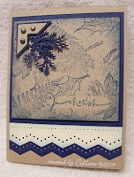
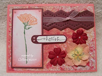
This was MY challenge - The would be a card a man sends to a woman, but, with a Color combo of kraft, vanilla and navy ... only 3 brads ... no ribbon or prima flowers ... images had to be botanical. I have a bunch of leaf stamps that I stamped with navy on the kraft. I had masked an oval using the word window punch from SU on a post it sticky so I could stamp from their warm words set "cherish". I then sponged the edges with navy. The added branches are navy punched with a MS punch then tucked under the navy/kraft photo corner. Where you see the vanilla strip, I kept pulling out ribbon (not paying attention to my own instructions, lol), then pulling them off until I finally realized the vanilla would be my 'ribbon'. I punched edge with another MS border punch in vanilla and the navy background then pierced the top of the vanilla panel.

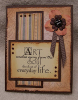
This challenge was an "Ode to Jimmi", one of the moderators for the VSN challenge weekend. She doesn't like hearts, so our challenge was to skip the hearts and stay away from red, pink and white. I loved this sentiment stamp that I just received, and went with a rusty brown feel. The sentiment panel and 2 background layers were all distressed then sponged with tea dye and a bit of cocoa. I finished with some distressed brown stickles, a peach & brown flower with chocolate ribbon accents and brad that I added some crystal effects to to beef it up a bit.

This challenge from LuvLee (Lee) was to incorporate a feather - whether it be real feather, image, etc. At least she didn't ask me to put glitter on it, lol. This took a bit of a think on my part, but eventually settled on this. The images are High Hopes - and I actually got the sentiment before I got the images, I loved the saying so much. The inside panel I left off for the picture, but this is what the inside of the card looks like. Both images were stamped on vanilla and colored with prismas/gamsol. I made the chicken one of those expensive black ones to incorporate the only feather I could find. I distressed the edges and sponged with tea dye. I also distressed the black mat and then took randomly knotted twine and wrapped around the image panel before popping up on dimensionals. The black feather sits below the image panel on top of the BG image from Cornish Heritage farms (thanks, Stacy/jbgreendawn @ SCS), that I also distressed and sponged with tea dye. I'm not sure what I'm going to do with this card - it makes me laugh!

This challenge was to use hearts - either 3D as in a box or other altered item, or incorporate it into a card. The artichoke layer is actually like a postcard. The eggplant heart is actually the 'card' part that opens. I wanted to send a birthday card out, so I used this image that DD picked out at HL when they were 1/2 off. Artichoke and eggplant combo is so pretty - I love green/purple together. I distressed the edges of the image panel after cutting with CM cutting system and sponged eggplant around the edges. When I finished with the card, it looked a bit nekkid, so I added the purple stickles to give it the brad effect. I think it's a cutie myself.

And that is the end of the challenges that I was able to complete.

Thanks for stopping in and taking a peek. Come back soon.

Friday, February 20, 2009

I did this card for the sketch Challenge #15 over at Limelight's blog: http://limelightpapercrafts.blogspot.com/


I received the image from the PIF thread (Pay it Forward, where you swap images). I colored her in with Copics and tweaked with my prismas and gamsol. I dotted around with a rose SU marker and finished off with 2 dots of liquid pearls for her buttons. This panel was matted on burgundy and popped up on dimensionals. The background DP is from the Basic Grey Bittersweet pad - ooh la la, I LOVE every sheet in there! The middle panel is from same Bittersweet pad, matted on burgundy and finished off with a white satin/organdy ribbon with a bow. The flowers I received from my Secret Cupid (Thanks, Julie). I used 2 each and skewed them to make them look fuller before adding white mat brads.
How come all these stamp companies keep coming out with new stuff ... I want it all!!! (Don't we all, lol).
Thanks again for stopping by ....

OH - AND IF YOU'RE NOT DOING ANYTHING TONIGHT!!! ....
Stop by VSN's "What's Love Got to Do With It" challenges beginning TONIGHT at 5:00 pm EASTERN time ... continuing till 11:00 pm ... then starting up again tomorrow at Noon til 11:00 pm.
I'm hosting the Saturday Night, 8:00 pm EST challenge! Come on over!!!
Here's the link to start you off: http://www.splitcoaststampers.com/forums/forumdisplay.php?f=54

All three of these cards were made with the Splitcoast sketch challenge SC216. This one I flipped on it's side for something a little different. This image is one of the new Whiff of Joy's by Elisabeth Bell, Willow sitting with Floral Wreath. I colored her with Copics and tweaked her hair with prismas and gamsol. The swirls on her dress were traced over with a clear glitter gel pen, as was the ribbon on her bodice. I used a blue glitter gel pen for her bows. She was cut out and popped up on dimensionals on top of the Tree Trunk image, which is part of the accessory pkg for this Spring 2009 Set. While I got the Spring 2009 Kit, they're now selling them individually over at Whiff of Joy, found here ... http://www.shop.whiffofjoy.com/ (For this one and the next, check out the Willow and Oakley *new* collection). I used my Nestabilities circle and scallop circle dies to cut the brown floral paper and kiwi mat. The clouds on the image panel were made with a free-form scallop template that I sponged bashful blue around, flipping & turning the template as I went. I finished off with a creamy ribbon knotted at the side.

This card followed the same sketch, but I made a square card. I love, love, love this color combination - the blue is unknown dp from the LSS .. the taupe looking one is from an SU paper swap - I need to check the catalog to see which paper it actually is. I sponged the edge of the background taupe with tea dye distress ink. I matted the blue dp with navy as well as the image panel which was stamped in Not Quite Navy on vanilla then sponged in tea dye distress ink. I pierced 2 corners and put brads in the opposing corners. I actually used my Creative Memories circle cutter for the 'arches'. I added some cream colored crocheted ribbon I got at the fabric store to finish it off.

This card is another one of the Whiff of Joy Elisabeth Bell releases, Willow with Sunhat. I colored her with Copics and tweaked with the prismas and gamsol (I only have a handful of copics, so shading is limited just yet). I added some more clouds, just like in the first card, then matted on navy. This is the same blue dp as above card, and the background is from the same swap ... not sure if one piece of 6x6 is going to be enough for me, lol ... going to have to buy the pack. I tied cream satin ribbon at the corner and popped the image panel up on dimensionals.
What I wouldn't give to have half the talent as Ms. Elisabeth Bell. Wowsa!
Anyway ... thanks for popping by.

Tuesday, February 17, 2009

Can you see the blinker to the left? Splitcoaststampers is having a blow out challenge this weekend in the Virtual Stamp Night thread found here:
http://www.splitcoaststampers.com/forums/forumdisplay.php?f=54
The challenges start at 5:00 pm on Friday til 11:00 pm, then starting up again Saturday at noon, again til 11:00 pm. For each challenge, you're given 45 minutes to complete each of them. I'm actually one of the hosts, Saturday night at 8:00 pm, but I can't tell you what any of the challenges are, it's a secret.

I feel like I haven't stamped very much because I haven't posted too many card up on the SCS site, but I've got a box full of cards that I can't wait to upload for these challneges.

Come on over to have some fun with the rest of us.
This card was for today's SCS color challenge, to combine Mustard, Rose and Kiwi. When you look at it typed, I can't imagine putting that combo together, but it actually turned out nice. I added a layer of close to cocoa behind the image cuz when I sponged the image panel, I grabbed the wrong ink pad (was going for the rose initially). I love this gold organdy ribbon - looks so close to the mustard cardstock. I'll for sure keep this color combo in mind.


This was for the SCS Techniques challnege from yesterday - to make a round topped box. There's a PDF template you can find here: http://www.splitcoaststampers.com/forums/showthread.php?t=419606&page=4] if you're interested.

This card was for last week's sketch challenge at SCS. The different DP is actually just one sheet that I cut apart and flipped over pieces of. I used a dark brown grosgrain ribbon to help it stand out a little more. I just got this image from Whipper Snapper, "Eli and Frogger". I pushed a little too hard and ended up with an extra dirt spot on his forehead, but I think its so cute. I tried a little something new with this coloring. One of my SCS buds - forgive me, it was either leibetty or jenmarie, I forget - gave me a tip to color with Prisma colored pencils then use the Prismacolor colorless blender marker to blend the colors in. It seems to have given me a deeper color to the clothes than if I use the gamsol, what do you think? I'm still trying it to see if this was a fluke. I love this image, tho ... I don't have too many boy images and this one is perfect.
This card was from last week's Technique challenge - To cut out part of an embossed image. I used one of my cuttlebug folders and embossed a piece of lavendar lace. I then sponged over the leaves and flowers with inks to bring them out more and then cut around part of the embossing. Underneath, on the white layer, I stamped a sentiment in eggplant and added a flourish die cut in the corner. In real life, the lavendar flourish looked good, but here, I think I might have been better off using the eggplant to cut out the flourish - what do you think? - Anyway, I sponged the edges and finished it off by adding faux pearls here and there. I had Eggplant as the base to bring the deeper color in.
Thanks for stopping by to take another peek.

Friday, February 06, 2009

This card is one of my new favorites, I think. The challenge was to go all out with the embellishments. I'm typically a less is more kind of gal, so to ME, this looks slightly over the top, but I know in looking at other cards, it's still on the light side. The image was colored with Copics and then I added glossy accents to the flames and yellow stickles to the centers of the flowers. I sponged the edges with Tim Holtz' Tea Dye and matted on kraft. The 'ribbon' is actually embroidered lace from Walmart in the shape of butterflies. It was very moldable, so I sent it up a meandering path along the saffron paper lace strip I created by punching both sides with a MS border punch then sponging the sides with tea dye also. To keep the shape of the butterflies' path, I added gold brads at each butterfly's center. I used an unknown Daisy yellow background DP matted on kraft again before adding the gold organdy ribbon and finishing off with a blue dragonfly brad.

I'm really liking this saffron, kraft, white combination a lot!

Thanks for stopping by. As usual, I love to hear any and all comments you'd like to make - positive or negative.


These 2 cards were made using a sketch from sketches by Tamara. I used my Creative Memories cutting system after I had folded the card in half.
I didn't realize it til after I posted this one, but I used the same Mouse Under Hat WoJ image for last week's sketch challenge ... So sorry ... He's so cute, though, that I figured no one would mind. I flipped this sketch on it's side to give it a little more interest. After coloring, I added glossy accents to the mousey's hat and his eyes.

Fruit punch stickles added at corners finished it off.


They actually had 2 color challenges over there this week. The original poster was in California - Pacific time ... and I know alot of us were anxious about it, so around the same time, Emily posted this other color combination: Cameo Coral, Creamy Caramel and Old Olive ... way more up my alley.

Image was stamped in perm black ink (was a gift through the PIF thread), which I colored with prismas and gamsol. I also followed The Mojo Monday sketch #72, which can be found at http://www.mojomonday.blogspot.com/. The 2nd layer down, I scallop border punched the bottom and circle punched the sentiment, matting it in coral then with the scallop circle punch, matted it up on dimensionals.

For the cross bar, I stamped a coral strip of paper with coral ink of a generic leaf, then matted it onto the Olive cardstock with a wider bottom margin so I could cut with the SU scallop border punch. On top of this, I added a strip of wasabi ribbon across the coral cardstock, finishing with a tied bow.

This color challenge was a bit hard.
SU's Lovely Lilac, Green Galore, Pink Passion and Temting Turquoise.
I'm not typically drawn to these bright colors ... (Ask me, then, why is it I had every shade of cardstock - except the pink passion - and every shade of SU inkpad) ... but I gave it a whirl. I stamped the flourish on SU's glossy white c/s then took above 4 colors of ink and randomly stamped them all over the cardstock, then covered the swirls in diamond stickles to sparkle it up a bit. I matted on lilac cardstock then put brads in the corners. This image panel was squared against the base of the card with another layer (green) set askew after having run it through the CB Swiss Dots folder. The base is actually white with a layer of turquoise that I also ran through the CB using a floral folder. After, I sponged some ink in green for the stemps and leaves with some lilac on the flower.

This second card was done with same technique- Versamark on glossy with different colors smoodged over the versamarked image. I matted on turquoise then green galore - both of which had the right side scalloped all the way down.
The base is lovely lilac with some polka dot paper that I ran through the CB argyle embossing folder then sponged with some lovely lilac. I finished the card off by adding some thin pink organdy ribbon that I threaded through the pink eyelets.
This card was made using the shadow box method, TLC206. The template can be found [url= http://www.splitcoaststampers.com/forums/showpost.php?p=3889159&postcount=1][color=blue] Here [/color][/url].

This was the first card I've ever done using this technique. The image is on white and then I colored with gamsol and prismas colored pencils before matting on red. This was actually fairly easy. The harded part for me was cutting out the red papers to put on top of the green to give a bit of a green border around the recessed window. That, and packaging it so it doesn't get squished when it goes through the postal thing.

This card was for the LSC 205 Limited supplies challenge over on SCS. Miss Boo had us create a clean and simple card. I had to add one layer ... I stamped the image and the sentiment on white then ran it through the cuttlebug Swiss Dots folder, then I sponged the edges with blue bayou before finishing off with a blue bayou double stitched ribbon. Base is Bashful Blue.