Friday, May 28, 2010

Last few that are finished for the Wish RAK Memorial Day Card Challenge over at Splitcoasters includes this Masucline birthday. I'm always afraid men will balk at too much going on, but I don't know. Because of the uncertainty, I kind of like to keep masculine cards lean on embellishments. The background was stamped with sanded then images were randomly scattered. I actually am growig fonder of the simplicity the more I see this card.


For this card, we had to follow a recipe:
- Add 1 peck of 3 different colors - check
- Add a dash of stitching - check
- Include a winged creature - check
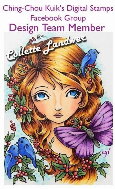
I first picked out the DP from Basic Grey's Lemonade and the image and Copic butterflies came after (its true).
I also spritzed over the entire image panel with Stampin Up's spritzer tool with a rose brush marker.

We got to chose our own technique for this next card. I chose the Grid Technique found over at Splitcoaststampers.


You first take the panel and score with a Scor Pal then flip it over to score the other side, creating a grid. Instead of stamping the paper, I flipped the scored panel over to lay on the inked background stamp and finger walked over it to give just a little bit of inked coverage from the Weave image. Anything that didn't receive ink, I went back and sponged a little saffron into the negative areas. I then stamped the silhouette image in chocolate. I DO like this one. I've tried the clear embossing with the grid stencil - while they both have the same beauty, this was a smidge quicker.

This challenge was to make a Fancy Fold pocket card.
I love the way this one turned out ... I'm becoming quite fond of my Copics, and can't wait to find more images they'll work well with. This one happens to be ... once again ... a Tiffany Doodles digital image.
Maybe next to the Copics, my current favorite is Basic Grey designer paper. This paper came from the Capella line - Stunning. In fact, I actually made an Archiver's run this afternoon after my Business Management test to pick up another pack of the papers, even though I've only used up a couple of sheets from the first Capella pack. I'm sure I'll go through it quickly. I just love the way it turned out on this pocket fold card. I'm going to add a couple of sheets of writing paper in the pocket so the soldier can write a longer note home

And that's it for the day ... I hear VSN is having a Challenge this weekend as well, so hop on over to Splitcoaststampers to see what's going on.

Thanks for stopping by ...
Here are some more contributions to the Splitcoasters Wish RAK Memorial Day card challenges ...

This first one was themed an 'I Love You' with your choice of layouts or colors - only caveat is that there be no red or pink ... Okay, how about green and blue?

I loved his bee image (and the lady bug is one of those pesky orange ones that sting when they chomp on you). Could either be for a man or woman to send to either a man or woman - LOVING my Copics, but dang is it hard getting into nooks and crannies, lol.


This card was inspired by some bedding found over at Rosenberry Rooms. Specificially, I fell in love with this soft color palette.
This image is a digital image from Tiffany Doodles - colored with Copics. I absolutely love the way this flower turned out, and very nearly scrapped the celery ribbon but figured it was a small part of the stem, so I'd keep Celery around.

This birthday card for a boy was inspired from the same bedding site, Rosenberry's. The set I liked was the Teddy Bedding Set found here.
I created the background paper by taking a fingertip sponge dauber and twisted it in caramel and then giving it a twist when it touched the paper. I kept bouncing it around so there are all different shades of the caramel and blue, depending on how much ink was in the sponge.

This card was made for a Female's birthday. It's another digital image that I colored with Copics. When dry, I added some Icicle Stickles to the petals and let it dry overnight. Never happened to me before, but when I rubbed on the petals next day, the sparkle from the stickles rubbed off (A BIG 'NO-NO' over at Operation Write Home for the troops). Problem solving cap yielded GLOSSY ACCENTS to the rescue! I encased the stickles in glossy accents which also gave the flower petals a bit more dimension. It's a good thing this wasn't a timed challenge, lol, for it took near on a day in a half to get it done. I DO like the bright flower against the mustard backgrounds ... Wasn't sure at first how that would pan out - but was pleasantly surprised.
I'll be right back with the balance of the cards ....


Been stamping up a storm over at Splitcoaststampers site in preparation for the Wish RAK's Memorial Day Card Challenge - All cards will be forwarded on to Operation Write Home for disbursement to some of our troops serving overseas so they can send cards home to friends and family. I was one of the cheerleaders (how appropriate is that - at least I didn't have to coach these girls, lol), so we got a heads up on the challenges. As I finished each card, it was driving me batty not to upload it so I wouldn't lose it ... until I realized - I can at least put it on the computer, DUH!
If you'd like to check out Operation Write Home , just click on this link.

Well, tonight was the reveal, so here goes ...

These first 2 were based on a card sketch (#8) over at Operation Write Home. I made the first one Monochromatic in chocolate - just like the way it looked. I stamped in chocolate on close to cocoaand matted using the chocolate and some chocolate designer paper from Stampin Up.

This second one was on the brighter side. The image is a digital image from Tiffany Doodles - Love her flowers - love, love, love them! I colored this one in with Copics. I'm not 100% down with the coloring, but this was a hard cookie to color!


I sometimes like to leave sentiments off the cards I send on to the troops - you never know who they're going to write to or what they're going to write about. Sometimes generic is the best way to go. (Now, if any military significant others disagree, please let me know).


This next one was for a Red White and Blue color challenge - one that we would write our own note inside, thanking the troops for all they continue to do for us. This image is from The Stamping Boutique (Patriotic Audrey) and she was colored with Copics. I just love how the background paper works with this image (and I'm so glad I stayed w/the green dress - afraid red or blue would have just been a little redundant.)


The theme to follow with this card - in case you couldn't tell, was CAS, otherwise known as Clean and Simple. This is basically just 2 pieces of cardstock. The base and the embossed panel. I put an oval mat in to resist the embossing in the center where the image was and colored it with Copics. I lightly sponged over the script embossing and called it a day. I actually like the way it turned out - hope you do too.
Thanks for stopping by to say hey !

Saturday, May 15, 2010

So excited for this new Elisabeth Bell digital image! Isn't she precious? I'm beginning to not be so afraid of the digital images, especially when one comes along by my most favorite artist! I colored this beauty with Copics. The image and mat were cut w/the Nesties Label #9 and then popped up on dimensionals. The card base is lavendar moon with plum pudding mats from Paper Trey, Inc. The DP is from their Guide Lines paper pack. Isn't it sumptious! The sentiment is computer generated. I finished off with a green satin ribbon and some half-pearls colored with a dark green Copic.


To find this and more digital images from Elisabeth Bell, Click Here .

While I didn't make this card as part of the Operation Write Home Memorial Day challenge sneak peek, I am going to send this one overseas as an extra. I just couldn't wait to show this image off, she's just darling!

Don't forget - May 28th, Memorial Day 2010 Cards for the Troops Challenge!

Thanks for stopping by!
CHA is coming here to Chicagoland the end of July. Can I get a "WOOT-WOOT"? I'm so excited to go. Unfortunately, the general public can't get in until July 30th - that's 3 days after it starts ... Wish I had an in to get in on the 27th. Wonder if my LSS is going (they SURE need to - need to see what's out there that people want more of!) ... Feel awkward asking them if do go, - can I buy my way in early. Hmm - food for thought.

Friday, May 14, 2010

Suzanne Dean challenged us to create a Copic colored card now that we've had a few of her tutorials. Here's my submission.

This image is a digital image from Tiffany Doodles called Mushroom Bug House. I'm not sure of the sentiment, there's no marks on the stamps.

I printed some Gina K digital designer paper called Bug Me Anytime - it just fit with this image. I also colored the prima flower on the bottom with copics to tie in the image and card base before adding a rhinestone brad to the center. The mat on the image panel was punched w/an EK border punch on the bottom before popping it up on dimensionals.

I'm LOVING learning more about coloring with these Copics ... as my stash grows larger, I realize just how many Copics I DON'T have, yet need! Suzanne is a phenomenal teacher. I can't wait to get to the next level. I think if a certification class ever DOES come around to my area, by the time she's done teaching me, I might be able to teach the class (NOT! lol)

Anyway ... keep an eye out on my blog for the Memorial Day 2010 Card Challenge for the Troops, sponsored by the Wish RAK group over on Splitcoaststampers. We've got 12 different challenges. This time it will be slightly different. All challenges will be put up at the same time and you'll have a few days to get the cards done. Come on over and have fun - it's for a great cause - the Troops certainly appreciate all the blank cards we send over to them so they can send notes home to family and friends. I'm one of the cheerleaders this time around and have been making lots of fun cards for the challenge, alas, I cannot post any of them until May 28th, so keep a look out.

Have a great day - and thanks for stopping by !
This card was made following two of Gina K's challenges - the first one, 4/29's Sketch Challenge and the other, 5/3's Color Challenge , to use turquoise sea and innocent pink. I had to substitute SU's turquoise and pretty in pink.

I used one of Gina K's Lovely Labels, stamped in turquoise on the pretty in pink and popped it up on dimensionals. The Background was created using one of the Stampin Around wheels, Daisies, and clear embossing it. The sentiment was from the same Lovely Labels set. I like the way the pearls add the finishing touch to this one.

Thanks for stopping by ...
These have been done for a while ... now that finals are over for me, have time to post them. I made these at a recent stamp camp - SO what I needed to get the juices flowing again ...
This first one was kind of like making a paper airplaine. AND in one of my favorite color combos - razzleberry and olive (or purple & green). The second one was made with soft pinks and vanilla - and the SU designer paper - Sending Love ... it's got the glitter 'baked in', so I don't have to worry, being the glitter-phobe that I am, lol. The ruffle was made using a crimper after border punching and then pleating it. Needs tweaking, but the more I do, the better they'll look, I'm sure.
This first image was colored with a blender pen and ink pads. I like the clean look w/just a hint of color. The second one is the FABULOUS Medallion stamp. Before stamping, took Soft Suede and 'worked it' ... running bone folder back & forth & over & under & flipped it and did it again to distress the paper. Not sure if you can really see it, but the paper looks like a piece of leather - very cool! Of course, had to order the stamp - have so many ideas swirling round, just need to put them on paper.
Thanks for stopping by!

Friday, May 07, 2010

Well, 2 days in a row, I must be on another roll, lol. Today's challenge over at Splitcoaststampers was Friday's Free For All, "Just Gelin' " ... or in other words, use a gel pen as you see fit. I've had this Medallion stamp for weeks now and just getting around to inking it up. I stamped the image in chocolate on close to cocoa paper and then sponged the edges with same ink. Hope you can see - I took my Creative Memories gold gel pen and highlighted all the top points on the medallion and the sentiment for a subtle sheen. Did the same a little to the doodles on the sentiment panel. Because of the gold highlights and ribbon, I wanted to keep it on the simpler side, layout wise, so I left the sentiment unmatted. Whatchu Think?
Thanks for the drive by :)
Finally seeing the bottom of the stash of cards, so made 2 yesterday ... Was eyeballing this Basic Grey sheet of paper I bought (they were out of the pack, darn) ... and this monkey came to mind. He's a Whipper Snapper image I colored with Copics. I wanted to have the flower match w/the DP, so I used Copics with the same colors as the BG paper.


This next one was a digital image from The Stamping Boutique that I colored with copics also. I used Not Quite Navy and Bordering blue with some Basic Grey Boxer paper. I punched out a strip of 'lace' from Sahara & a Martha Stewart punch & then sponged the edges. I was going to add some kind of embellishment, but couldn't get it to work without covering the lace, so I left it on the simpler side.

Thanks for stopping by ... Have a great day !